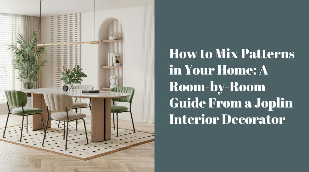
There’s a reason so many living rooms default to solid neutrals. Pattern feels risky. One wrong move and a room can tip from “collected and intentional” into something that’s harder to explain to guests. But the rooms that stop people in their tracks, the ones that feel genuinely alive and personal, almost always have pattern in them. Usually more than one.
The good news is that mixing patterns isn’t as unpredictable as it seems. There’s a logic to it, and once you understand the underlying principles, it starts to feel less like gambling and more like composing.
Start With a Common Thread
The most reliable way to mix patterns without creating visual noise is to anchor everything to a shared color. It doesn’t have to be an exact match, and in fact a little variation in tone tends to look more sophisticated than a perfectly coordinated set. But when a floral, a stripe, and a geometric all pull from the same general family of colors, the eye reads them as belonging together even if the patterns themselves are wildly different in scale and style.
This is why working with a curated fabric collection is so useful. Lines like Duralee, Fabricut, and Kasmir are designed with pattern relationships in mind. The colorways within a collection are built to work together, which takes a lot of the guesswork out of the process.
Scale Is What Makes It Work
If there’s a single rule worth internalizing about pattern mixing, it’s this: vary the scale. A large-scale pattern paired with a medium and a small will almost always read well together, even if the patterns themselves seem like an unlikely combination. What creates chaos is putting two patterns of the same scale side by side. They compete rather than complement, and the room starts to feel visually loud in a way that’s tiring rather than exciting.
A practical example: a large botanical print on a sofa, paired with a medium-scale stripe on an accent chair, and a small geometric on a throw pillow. Each pattern has its own territory. None of them are fighting for the same visual frequency.
Texture Counts as Pattern
This is the part that trips people up most often. When we talk about pattern mixing, we’re not just talking about printed fabrics. Texture has a visual rhythm of its own, and a nubby linen, a woven wool, and a smooth velvet bring pattern to a room in a quieter, more layered way. Working texture into the mix gives the eye places to rest between bolder statements and keeps the overall composition from feeling flat.
A room that relies entirely on printed pattern can feel busy. A room that balances printed pattern with textured solids tends to feel rich and considered. This is where the depth of a line like Norwalk, with its range of fabric options across texture, weight, and finish, becomes genuinely useful.
The Role of the Rug
Area rugs are often the unsung heroes of pattern mixing because they cover so much visual ground. A patterned rug under a patterned sofa can absolutely work, but the scale relationship between them has to be deliberate. A large, loose geometric rug under a smaller-scale floral sofa tends to read beautifully. A rug and sofa with similarly sized patterns competing at the same level will make the room feel unsettled.
If you’re starting a room from scratch, choosing the rug first and building the pattern story outward from there is often the most reliable approach. It’s a big piece with a lot of influence, and it’s easier to pull fabrics to a rug than to find a rug that works around fabrics you’re already committed to.
When to Bring in a Solid
Not every surface in a room needs pattern, and knowing when to reach for a solid is part of what separates a well-composed room from an overwhelming one. Solids give the eye permission to pause. A solid-colored pillow between two patterned ones, a simple linen on a chair surrounded by more expressive pieces, or a clean painted wall behind a busy window treatment all serve the same function: they keep the room from exhausting the people in it.
The solid doesn’t have to be neutral either. A deep, saturated solid in a color pulled from your dominant pattern can be just as commanding as any print, with the added benefit of giving the room a moment to breathe.
Getting It Right the First Time
Pattern mixing is one of those areas where the difference between a room that works and one that doesn’t often comes down to experience. Knowing which patterns will live well together in an actual room, under real light, with real furniture around them, is something that takes time to develop. It’s also exactly the kind of thing Margie and Kim do every day.
If you’ve been playing it safe with solids and neutrals because patterns feel like too much of a gamble, come have a conversation. Stop by the showroom at 2027 Roosevelt Ave in Joplin, or reach out to schedule a consultation. A little guidance goes a long way toward making a room that feels genuinely yours.