Colors play a significant role in interior design because they can influence the mood, emotions, and overall feel of a space. They have the power to evoke feelings of calmness, warmth, energy, and even excitement, and can help to set the tone for a room or space.
Here are some ways colors can impact interior design:
- Mood: Colors can set the mood of a room or space, and help to create a desired atmosphere. For example, cool colors like blue and green can create a calming effect, while warm colors like red and orange can create a more energizing and exciting atmosphere.
- Perception of Space: Colors can also impact the perceived size of a room or space. Lighter colors tend to make a space feel larger and more open, while darker colors can make a room feel smaller and more intimate.
- Style: Colors can also be used to reinforce a particular style or theme in interior design. For example, bright and bold colors can create a modern and eclectic feel, while muted and neutral colors can create a more classic and traditional style.
- Contrast: Colors can also be used to create contrast and balance in a space. A complementary color scheme, where two colors opposite each other on the color wheel are used, can create a striking and balanced look in a room.
Colors are an essential element in interior design, and can be used to create a desired mood, style, and atmosphere. They can transform a space, and bring it to life, making it feel more welcoming, cozy, and aesthetically pleasing.
Let’s discuss the trending colors for spring 2023!
Robin's Egg Blue is a soft blue-green color that gets its name from the blue color of the eggs laid by the American Robin bird. This color is often associated with spring and nature, and it can be used to create a calming and soothing atmosphere in home decor.
Lavender is a soft and delicate shade of purple that is named after the lavender flower. It is a popular color for spring because of its calming and relaxing properties. Lavender is often used in home decor to create a peaceful and tranquil ambiance.
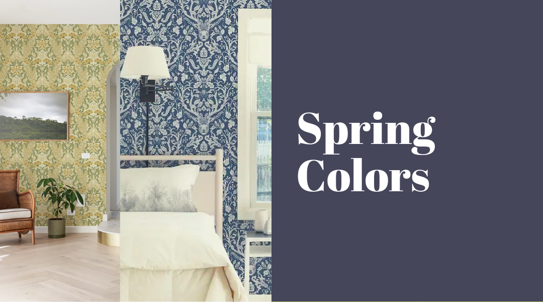
Every shade of unconventional blue is in and refers to blues that are not traditionally associated with spring, such as navy blue or royal blue. However, these shades can still be incorporated into spring decor by pairing them with lighter, brighter colors.
Pastel pink is a light, soft shade of pink that is often used in spring decor. It is a popular color for Easter and other springtime celebrations, and it can be combined with other pastel colors like blue and green for a fresh and cheerful look.
Teal is a mix of blue and green, and it is a popular color for spring and summer. Teal is often used in bohemian and beach-inspired designs, and it can be paired with neutrals like white and beige for a relaxed and casual look.
Blood orange is a vibrant shade of orange that is named after the fruit of the same name. It is a bold and energetic color that can be used to create a striking contrast with other colors like blue and green. Blood orange is often used to add a pop of color.
Green is a classic spring color that represents growth, renewal, and nature. It can be used in various shades, from light pastels to vibrant emerald greens. Green is a versatile color that can be paired with other colors like yellow, pink, and blue to create a fresh and lively look.
Contact us
Interested in incorporating these colors in your home? Contact us today!
